Trendy color associations
We have seen in the first part of this article that when it comes to color combinations, and the choice of shades and hues, most of the part depends on personal taste not on fashion and trendy. However, let’s see other stunning color combinations that will be around us these years.
Read this article and do not forget to check our YouTube channel “Grig Stamate” for other amazing videos:
https://www.youtube.com/@GrigStamate
Small Spaces #2, Small Living Rooms in Cozy Colors (video)
Make a small room seem larger with paint colors | Simple Ways to Create a New Home Interior #10 (video)
Other several ideas for color combinations:
- Pink and gray
Pink and grey together is definitely not a design combo you see every day. But there is no doubt that the fashionable color scheme for these years offers a truly unexpected contrast. The pink color both accentuates and softens the grey. This combination shows off the beauty of mature colors in a beautiful way by combining delicate hues. Pink is a raw, slow color. The grey color, meanwhile, exudes a solemn but polished air.
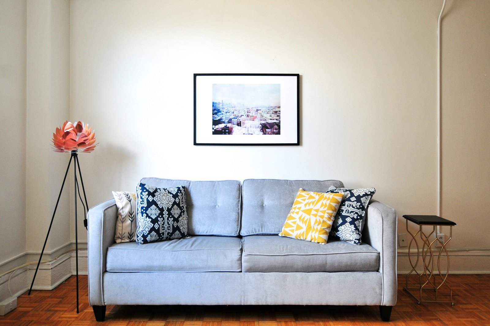
Grey is frequently viewed as monotonous when used alone. However, if it is accompanied by colors, such as pink or yellow, it completely alters its appearance. Additionally, the pink shade can make the color scheme a little bit shorter and more approachable. When you blend colors with these various tones, the room is typically much cozier and pleasant than when you merely combine low, muted tones.
- Blue and white
This is now a really well-liked suggestion for including contemporary colors in this year. Dark clouds travelling through a clear blue sky are undoubtedly conjured up by the late and newly introduced color combination of blue sky and white. The blue color symbolizes truthfulness, integrity, and respectability. The color promotes relaxation while also being classy. White symbolizes purity and works wonders to generate a sense of tranquilly. In actuality, there aren’t many colors that don’t complement white. However, this is one of the best color schemes that will still be popular for many years when it comes to sky blue or sky blue. It is a simple trend for color coordination that doesn’t need much thought.

- Yellow and green
This color scheme is reminiscent of the summer light reflecting off of evergreen wood. This is the atmosphere your home will exude with this color scheme. It works well to provide your home with a cozy yet inviting atmosphere. Green is a color that represents nature and progress. Yellow is radiant with unending joy.
- Pink and purple
Since last year, pink and purple color combination has been spotted in numerous contemporary and chic settings. However, we believe that even this term, this will probably still be relevant. As previously said, this color scheme works wonderfully with contemporary and chic design. Of course, how a tone is utilized in relation to other colors also affects this. Decide whether this pairing of colors appeals to you by combining pink and purple.
Other related posts from our website:
https://howtobuildahouseblog.com/how-to-furnish-your-living-room-with-colorful-sofas/
https://howtobuildahouseblog.com/living-rooms-with-neutral-background-and-vibrant-color-accents/
We sincerely hope that our video and post can help you.
Please, write your opinion in the comment section and do not forget to subscribe to our channel if you are new to our YouTube channel.
See you soon at another post.
Bye, Bye


