Living room color palette and the psychological role.
Color combinations in the interior play an important role not only from a design standpoint, but also from a psychological standpoint. The living room frequently reflects the personality of the house’s residents and serves as a kind of island for leisure and discussion. It is not required to use bright, flamboyant colors or repaint to create an original, beautiful, and stylish interior and freshen the atmosphere.
Read this article and do not forget to check our YouTube channel “Grig Stamate” for other amazing videos:
https://www.youtube.com/@GrigStamate
Make a small room seem larger with paint colors | Simple Ways to Create a New Home Interior #10 (video)
Small Spaces #2, Small Living Rooms in Cozy Colors (video)
You need to know some basic rules regarding the colors.
When selecting ornamental features, colors and textures of materials, and furniture for the interior of the living room, everyone is essentially based solely on their taste and practicality. Intuition, on the other hand, is not always the best guide. You must understand certain basic color guidelines in order for the walls, floor, ceiling, furniture, interior design, and lighting to appear as a single harmonious picture. Colour options are quite varied and have a significant role in establishing the mood of the environment.
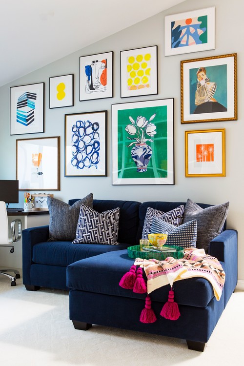
Colour, according to psychologists, elicits one or more emotional responses in people. Each palette has its own personality. Shades of orange and yellow are tonic, optimistic, and joyous. The blue scale, on the other hand, calms, soothes, and encourages speedy falling asleep and healthy sleep. A color combination can also work to prompt negative or positive reactions in a person.
Color determines how a person sees a space.
Colour influences how people see a space in addition to its psychological impact. Light shades broaden it, dark shades limit it, while bright, showy ones absorb light and necessitate additional lighting. You can use paint to visually enhance space flaws, expand low ceilings, and restore the proportions of a too narrow room. Colours chosen carefully for designing the living room aid in completing the following tasks:
Change the optical sense of the room’s size; zone space; give the design cold or heat; alter the proportions of height and shape; and add volume and depth to the composition.
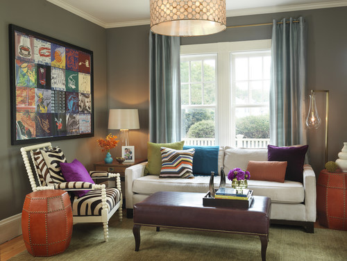
3 color combination – the most popular combination.
The most common combination approach, the three-color combination, is considered. Designers propose that no more than three chromatic varieties of tints be used in the room’s interior design. However, you can combine them in a different way while keeping the color table or color wheel in mind. A color chart or color wheel is an essential tool for designers as well as painters and photographers.
These technical assistants are built on the rainbow spectrum idea, combining close hues, and blending into one other as smoothly as feasible. They are used to generate color schemes.
Neutral hues for creating a calm and elegant interior.
The neutral tones are the most restrained and minimal. It is ideal for creating an elegant and serene interior. These colors are also known as achromatic. They can be combined in a variety of ways. Without the addition of vibrant highlights, neutral colors look excellent on their own. If you are concerned that the interior will be too rigid and uncomfortable, you should experiment with textures, decor, textiles, shining surfaces, and metal elements.
Warm tones – popular color combinations
Warm colors are quite popular when designing living rooms because they make the space feel cozy, warm, and conducive to conversation. Warm colors are very upbeat, joyful, and set the perfect tone for the people who are present. Juicy combinations are ideal for relaxing in the winter because they warm you up and put you in a pleasant mood. Choosing a warm color scheme is a straightforward process. Natural is one of the canonical.
Other related posts from our website:
https://howtobuildahouseblog.com/summer-colors-in-the-home-interior-design/
https://howtobuildahouseblog.com/consider-a-combination-of-colors-and-light-your-home-interior/
We sincerely hope that our video and post can help you.
Please, write your opinion in the comment section and do not forget to subscribe to our channel if you are new to our YouTube channel.
See you soon at another post.
Bye, Bye


